Cohort Report Helps In Gauging Customer Retention Rate
Good news for all online store owners! Unlike brick-and-mortar stores, you can easily do what they can’t. Why? Thanks to Google Analytics, you can measure your business success so easily. All necessary data regarding your business progress can be so easily tracked. Some of them are conversion statistics; total visitor fluctuations; measuring the CTR or Click through Rates and you can measure average time spent on your site. Just log into your Analytics account and voila! Still Analytics report has its own restrictions like how can you measure customer retention percentage?
Herein I shall quote a famous and commonplace statement, It is common knowledge that the cost of acquiring new customers is often ten-fold that of keeping existing ones. Measuring customer retention is very important however most business houses skip this matter.
Introduction to Cohort Report
This is a common data analysis technique to separate customers according to Date of Acquisition or Date of First Session. These separate groups are called cohorts. Within this group or cohort subsequent addition of customers is done according to their frequency of site visit.
There is another parameter for separating people in different cohorts. One can form a cohort based on a certain time within which customer has completed his transaction. Take for example you have heard Ecommerce owners talking about how many customers have transacted between the Thanks Giving and Christmas.
Utility of Cohort Analysis Report
Before long Cohort Report could not be directly generated through Analytics tool. One would have got that by segmentation. But now Google has made it easier for us to generate this report.
After initial interaction how far your new customers are engaged with your site is what you can measure through these cohorts. But the actual power underlies in comparing cohorts.
Example
Suppose you are running a SaaS business model and have changed your onboarding process recently. Now you want to measure the change it has brought regarding customer engagement. This has been made simple with the use of comparing 2 cohort reports. The older report that contained previous depth of customer interaction under that business model and the newer one that displays newer engagement are compared.
This out-of-the-box approach relies upon return user data and not on what they have done on return. In some cases this report may be useful. However, we have found the Goal Completions per User metric to be more useful in comparison with the previous one. Only those users would be plotted who have finished at least one transaction.
Further segmentation of reports can be done while comparing multiple entry-points and channels.
Shortcomings of Cohort Report
A few of restrictions posed by Cohort Report are as followed:
1. You can only tabulate a total number of completed goals and there is no way to figure out the performance of 1 particular goal.
2. At any time, you can compare only 4 cohorts.
Analyzing the Work Flow of Cohort Report
Let’s analyze the Work Flow of Cohort Report with an example.
Example
Suppose you are a blogger. To understand the behavior of weekly active users you want to resort upon Cohort Report. This would be highly beneficial for your business.
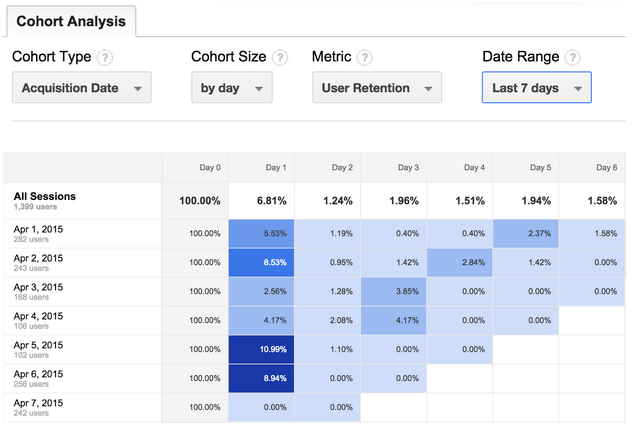
First you need to choose your cohort type. As a regular blogger, you publish lots of content. That’s why set its size to daily. Set the metric to User Retention. This will tell you the percentage of readers who visit your site on a daily basis.
At last set the rate of date to previous 7 days.
Now take a look at the report. We suggest you to jump to the tabular data displayed under time trend.
A separate cohort is displayed in every row where it represents 1 day. In total 8 rows will be displayed as your date range was set to 7 and the 8th row All Sessions Data. You are getting the rate of retention for individual days. For thoroughly analyzing the report, please concentrate on cells which are having dark colors. Otherwise, select the cells which have abnormally high numbers.
To make it simple we are going to provide an example table, in the below:
Herein you can see that readers, who began their interaction on 27th Jan., had higher rate of return, the next day. This rate is really much higher than others.
A bunch of great questions: What’s the reason? Where have they gone now?
As you scan through it, add your own business contexts to this data. Did you begin some campaign that resulted in such report generation?
Any further confusion will be cleared when you will segment this report.
For further support in this matter you can contact a reputed and skillful SEO service company. We hope that now onwards you will take help from Cohort Report to help in your business in better manners.

 Ecommerce Development


