
 July 6, 2022
 A website is an essential and integral part of your business today. It is the right platform that informs your visitors, attracts them and gives them a necessary platform to connect with you. It establishes your position and your business reputation in the market. It has to be attractive, informative, engaging, and moreover impressive to appeal to your clients.
But only your website is not essential to establish your digital presence. If you want to reach out to people who are glued to their smartphones, you have to take your business to them. Now, you may wonder, how is that possible? Well, we have the answer- a mobile-friendly website!
Just because you have a website doesn’t mean it is well-optimized for every device, especially mobile screens. You need to make this decision as it can bring a positive impact on your business and its key performance areas.
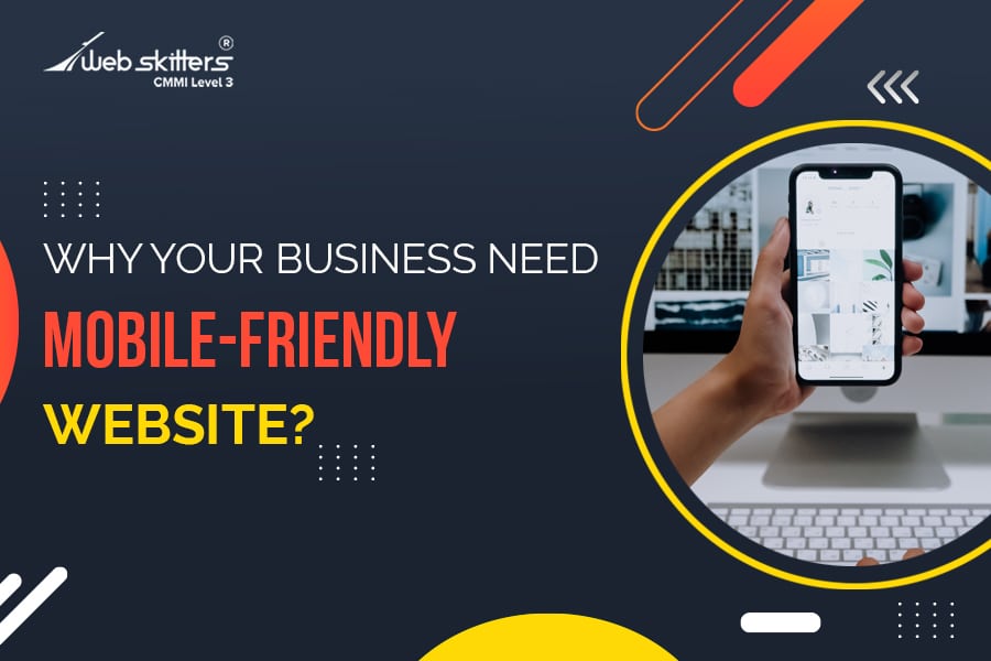
What Is A Mobile-Friendly Website?
A mobile-friendly website is one that is well-optimized for mobile phones. It appears correctly on mobile devices, iOS or Android. The responsive feature of the website will allow it to respond to any and every device. It is scheduled to give visitors a streamlined experience when they view your website. It helps in enhancing the engagement of your website.
Standard websites are optimized for desktop screens but do not perform well on smaller screen sizes. The content, format, and layout everything should be aligned well with the smaller screens to make it mobile-friendly.
A few important aspects that mobile-friendly websites should include in them are:
- Touch-friendly buttons and elements on the page
- Swift download speed
- Mobile-friendly navigation
- Larger and easy-to-read texts
- Attractive images, well-optimized for mobile
Mobile Technology Today!
In this tech-driven age, mobile has become an integral part of our lives. Mobile internet traffic has also surpassed desktop traffic. People prefer to have everything on their small screen so that they can access it from the comfort of their bed or even when they are on the go.
Websites today have to adopt the mobile-friendly format if they wish to receive more visitors and attract the attention of the millennials. Mobile technology has revolutionized the online world and is also reshaping the performance and functions of the website. Embrace these technologies and equip your business with unrivalled opportunities at your disposal.
Who Needs Mobile Visitors?
If your website is not performing well, you might question yourself why? Where are you lagging behind in your approach? Well, the answer is in your mobile-friendly approach.
Recent studies have proved that most of the digital traffic online is now coming from mobile devices and apps. So, if you have still not embraced the technology, you are probably making the biggest mistake for your business.
It is true for businesses of all verticals. A large number of your clients are waiting online to reach out to them through a mobile device and positively impact your overall success in search engines. Every business from every vertical needs a mobile visitor; it is not an option but a compulsion to achieve your success.
Why Does Your Business Need A Mobile-Friendly Website?
The future of web design is heading towards a mobile-friendly website. The usage of a desktop is becoming obsolete with the increased use of smartphones. And this is the new wave of connectivity. There is a growing tendency towards mobile use as it brings the entire world to your fingertips. It is not just for your convenience, but it is ideal if you want to achieve your business goals. Let us give you some reasons why your business needs a mobile-friendly website:
- Always Accessible
A mobile-friendly website helps in boosting your sales and conversions. It allows the users to interact and engage with your brand across all devices. They don’t need to face any inconvenience while interacting with your website. Being available on mobile eases your accessibility. The increased accessibility creates long-term loyalty and customer retention rate for your business. Hence, it is an ideal platform for you to invest in.
- Establishes Credibility And Trust
To establish credibility and trust, you ought to deliver an excellent mobile presence. If you want to capture new demographics or retain existing customer segments, your website has to have its presence on the smartphone display. Your customers must know that your brand is easily accessible at any time. Developing a mobile-friendly website is one of the best and strongest ways to accomplish the sense of trust-building within your customers. You need to exceed your customer’s expectations by providing their sense of authenticity.
- A Cost-Effective Way To Boost SEO
Exceeding your business’ overall sales and conversion, you need to have a mobile-friendly website. Offering a seamless mobile experience to your customers, give you an upper hand to establish your presence in the hyper-competitive digital landscape. You need not maintain different versions of your website making it responsive is enough for your business. Google also prefer mobile-friendly websites hence if you are willing to maintain a high SEO ranking, then the mobile-friendly website is a crucial measure.
- Higher Page views Per Visit And Lower Bounce Rates
If your website loads fast on mobile, appears beautiful and offers convenient navigation, then the visitors will be encouraged to spend more time on your website. It increased your page views and significantly lowers the bounce rates. The mobile-friendly website helps in keeping your visitors on the website for a longer period of time. It gives them more chances to converse.
- Contributes To Customer Loyalty
If you are willing to establish a positive impression on your customers, then you need to have a responsive website, which can encourage customers to come back to your website, again and again. It entices the customers to maintain long-term relationships with the brand and contributes to enhancing customer loyalty towards your business.
- Attracts More Users
As your website easily fits within the small screen of a mobile, you can reach more users and attract them to your business. Mobile users don’t like to scroll horizontally or even zoom in to read your content. All they need is a perfectly-fit website that excellently displays your content on the screen. Make your layout display well on every model of smartphone and tablet.
- Be Competitive
Turn your website into a mobile-friendly one. If you haven’t done it, make it your priority. Your competitors are already leveraging the benefits of a responsive website before you lose a large share of the market to them, get your website on the small screens now. People do not prefer to scroll through a desktop anymore. At least, it’s not their priority. So, what do you need to do? To stay in the competition, you ought to be mobile-friendly.
- Amplify Your Visibility
One of the best benefits of mobile-friendly websites is that you can reach a wide audience. Online sharing becomes simpler with the responsive design, which helps in increasing your visibility. People can easily access your business, and it helps you to be visible in front of them. Making you more visible to your audience allows you to gradually turn your business into a brand.
Take Action!
Don’t throw away your chance to reach out to your mobile customers. Let your search traffic increase through mobile-friendly design. Hire a team of widely experienced web developers, who can easily make your website mobile-friendly and be ready to venture into the wide mobile space. It has great opportunities waiting for you. Tap it with the right measures and your business will take off in the right direction.
Every major purchase and decision made by your customers are happening through mobile devices now. You definitely don’t want to ignore or miss out on this wonderful opportunity. Get in touch with us and tap it now!

 UI/UX Design
  Web Development
  Mobile App Development
  Internet Of Things
  Game Development
  Artificial Intelligence
  Digital Marketing
  Data Science Consulting
