Dark Patterns in Ecommerce are Rising: Here’s How to Build Website Ethically
Imagine this: You’ve encountered an exceptional product online that you have wanted to purchase for days or even years. The e-commerce site selling the product is giving it away at a 50% discount. Too good to be true, isn’t it?
However, your dream becomes a nightmare once you reach the checkout page!
Extra charges were imposed on your purchase, manipulating you to pay an extra 10% of the original price. This is one of the many examples of dark patterns in e-commerce.
If you think you’re the only one getting duped by this unethical and aggressive persuasion, you’re wrong. The majority of online customers face this globally. What’s more interesting is that despite being condemned as an exploitative and unethical practice, dark patterns in e-commerce persist and are growing in popularity. And, why is that? Because they do work!
However, the businesses that resort to dark patterns notice a considerable decline in brand loyalty and repeat business. This can harm a business in the long run. Even, there is a risk of penalization from government agencies due to aggressive persuasion and manipulation of the consumers along with their unethical nature.
So, e-commerce businesses should avoid incorporating dark patterns in E-commerce sites to avoid getting penalized and losing brand loyalty and reputation in the market. This is where ethical web development comes into the picture.
This blog will primarily focus on 10 recognized dark patterns in e-commerce platforms and how governments all around the globe are waging an invisible war against them. We will also walk you through the ways these unethical practices impact consumers and why ethical design practices are gaining traction worldwide. Before everything, we need to understand what dark patterns are. So, without further ado, let’s get to it.
View this post on Instagram
What Dark Patterns in E-Commerce Are?
Each day, millions of consumers globally face the risk of unwillingly giving away too much information— be it related to money or privacy! To some businesses, dark patterns are the goldmine of conversions. However, when the revenue is generated from unethical sources, it is high time to introspect the business choices.
Simply put, dark patterns in e-commerce are defined as the use of deceptive and manipulative practices that are designed specifically to deceive users into doing things that don’t benefit or interest them at their expense. This is the explanation of dark patterns stated by Harry Brignull (a London-based UX designer) who coined the term in 2010.
Let’s look at an example of these dark patterns.
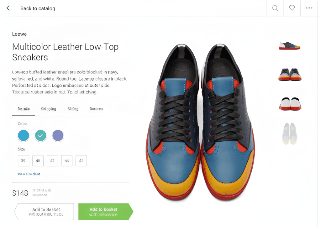
The page seems ordinary, doesn’t it? It is just like any other e-commerce product page. However, if you look closely, the green button saying “Add to basket with insurance” is much more prominent than the white button displaying “Add to basket without insurance”. So, if you don’t pay enough attention, you’ll end up buying the product with insurance, even against your will. This is how some e-commerce sites dupe their consumers by sheer manipulation.
If you think that this is a recent phenomenon and is declining for being unlawful, you can’t be more wrong! Don’t believe us? Let’s talk data!
A 2019 Princeton University study found that almost 11% of approximately 11,000 e-commerce websites leveraged deceptive, aggressive, and misleading tactics to manipulate users. Moreover, according to Dovetail, 40% of consumers experienced unplanned financial consequences due to dark patterns in 2023.
So, in this business world driven by unethical practices like dark patterns in e-commerce, being a good brand can make all the difference to your business. Strive for ethical web development, which can only be achieved by a trusted e-commerce development company.
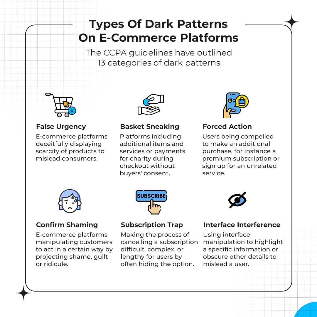
The 10 Recognized Dark Patterns in E-Commerce Platforms
Now that we know what dark patterns are, let’s highlight the 10 infamous and well-recognized dark patterns in e-commerce that are plaguing the world right now.
1. False Urgency
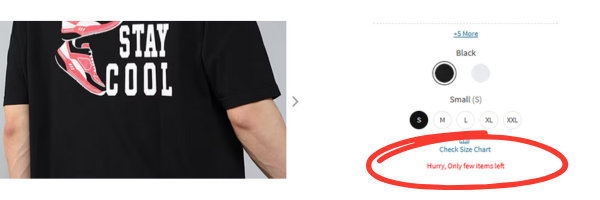
Have you ever gone to a site to buy a product and it says “only a few left”? That is exactly how this trick works. They manipulate and deceive users by creating a false sense of urgency. This compels the users to buy it immediately in a hasty fashion without checking much about the product, including the quality.
This can be seen in the screenshot above which deliberately showcases the high demand and scarcity of the product in bold red colors. This is a classic example of false urgency.
2. Subscription Trap
Have you ever noticed how overly complex the cancellation process is for a subscription? This is one of the major dark patterns in e-commerce, known by the term subscription trap. Businesses make canceling a paid subscription almost impossible or intricate to restrict their users from opting out.
Some platforms even compel users to enter their payment details in case of free subscriptions (displayed) and then dupe them into being a part of paid subscriptions. This trick leads to continued financial transactions without user intentions.
3. Interface Interference
You must have encountered instances where the “No” option for a purchase feature is light-colored or in a tiny font. Pop-ups can also appear whenever you try to click the “No” button, obstructing the view. This is not a design error but a deliberate attempt to lead you towards an unintended purchase.
Simply, interface interference is the incorporation of design elements that deceive the user by overly emphasizing one feature while deliberately obscuring the other. This is done to mislead the customer and steer them clear of their decisions.
4. Basket Sneaking
So, you’re purchasing a product for price “X” USD. When you checkout, you find yourself charged an additional 100 USD in the form of levy, insurance, or donation. Seems familiar, right? This is known as basket sneaking. This leads to unexpected costs for a chosen service or product by the customer.
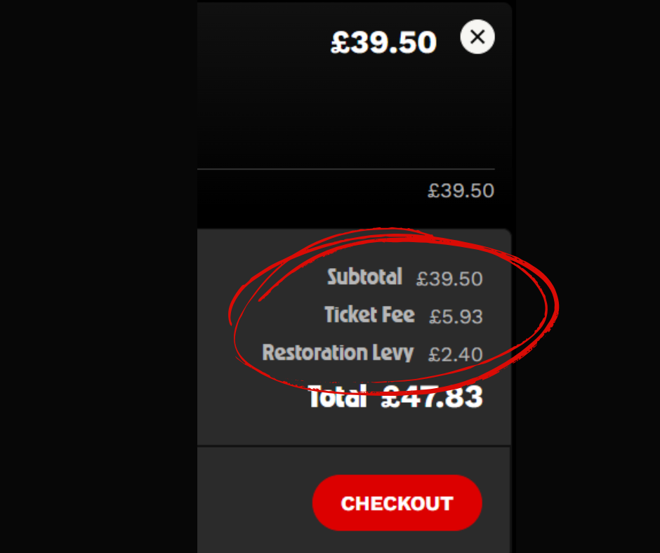
The screenshot attached above is an example of basket sneaking. While the displayed price was 39 GBP, the total checkout cost was close to 48 GBP in the form of ticket fee and restoration levy.
Note: The “necessary fees” which are disclosed during the purchase cannot be considered basket sneaking. Necessary fees include delivery charges, government taxes for the product, gift wrapping, and platform fees.
5. Nagging
Have you ever encountered a site that constantly annoys you with persistent and repeated disruptions through requests, options, or information requesting you to buy the product? This is known as nagging.
Nagging entails websites continuously instigating visitors to download their applications, application messages that persistently request customers to provide their personal details under the veil of security, and continuous pop-ups nagging you to enable cookies or notifications without any option to deny. This dark pattern tactic exploits the users by manipulating their behaviour for commercial gains.
6. Trick Question
You will find a plethora of sites and platforms that twist questions to manipulate you. You wouldn’t be able to tell whether a site or platform is deliberately prompting you with a trick question or not, as it plays with your psychology. Suppose, a site asks you if you want discounts like this: “Do you choose not to receive updates on our discounts forever?” instead of asking, “Do you want to receive updates on discounts?” You’ll always find an emotional resonance with the previous statement. This is how this strategy works. It manipulates user behavior with these trick questions.
Furthermore, instead of giving options like simple “Yes” or “No”, they can frame the option like “Yes, I would like to get discounts” and “No, I don’t mind spending more” respectively. This intentional use of vague or confusing language, like double negatives and confusing words that aim to manipulate or mislead a customer from taking their desired action for business gains is one of the most infamous dark patterns in e-commerce.
7. Disguised Advertisement
In this trick, a platform may present ads in a way that masks their true nature. They make them appear like other content such as UGC (User Generated Content), news articles, or false ads. The primary intention of this practice is to smoothly place these advertisements into the overall interface of a website, deceiving consumers to click them.
8. Confirm Sharing
Have you ever come across a website or application that made you feel bad for not buying a product? It isn’t as uncommon as it seems. The primary objective of e-commerce platforms that practice this is to instill shame, ridicule, guilt, or fear in the minds of users. The intent of this tactic is to manipulate the users to take specific actions that will contribute to the business’s commercial gains.

Let’s see this example. Here, instead of including simple “Yes” or “No”, the platform twisted the options to manipulate users. The words “discounted prices” and “shopping at full prices” instills an emotion of guilt or missing out among the users, leading to confirm sharing.
9. Forced Action
You must have seen platforms or websites that include unrelated compulsory purchases along with your desired product purchase. This includes subscriptions, signing up for services, or other additional goods. This is to force users to avail a service they are not interested in through manipulation.
A wide variety of forced actions are there which are considered dark pattern practices like:
- Resisting users to access a paid service without paying additional fees
- Forcing users to sign up for a newsletter
- Prohibiting users to avail a service without an app download
- Pressurizing them to share personal information for unintended purchases
- Creating additional complexity for users to manage their privacy
One such widely known case that made the headlines was Epic Games, the developer of the popular game “Fortnite”. It is a free-to-play game which used forced action when it came to in-game purchases and was penalized by the FTC (Federal Trade Commission) in 2023. The business had to pay 245 million USD for that violation.
10. Bait and Switch
In this case, you will be advertised with a particular outcome based on your action and then provide an alternative that substantially varies from what was portrayed. Bait and switch is an extremely popular method of e-commerce manipulation among businesses leveraging dark patterns in e-commerce.

For instance, when you go download the VLC player for PC, you will find links on the web page that’ll provide you a link to download Web Companion. If clicked on the wrong link, the consumer will be directed to download another product which is widely different from the intended product.
This also happens when you go on purchasing a product that was advertised. Instead, you’re being told that the product is out of stock and advertises a completely different product (sometimes a more expensive one).
How Does it Impact Consumers Globally?
By now, we are familiar with the 10 most infamous dark patterns in e-commerce. Now, the question is how these unethical practices impact customers globally. Let’s find out!
These dark patterns utilize the most crucial element that enhances user experience nowadays. It’s nothing but emotional resonance.
In simple words, emotional resonance is a website’s ability to evoke emotional responses in users when visiting a site. This concept can be exploited to make dark patterns in e-commerce much more effective. Apart from the above-mentioned tactics, there are other strategies employed by businesses as well. For instance, an e-commerce website or platform might use high-resolution luxurious images, impressing users and leading them to overlook these patterns while manipulating them to make a purchase.
But, why does this happen? This happens because aestheticism appeals brain’s limbic system. This is the region which determines the emotional and motivational response of the brain. This way, it manipulates consumers when making decisions. So, dark patterns are curated specifically to exploit this part and trigger responses that allow consumers to make decisions that are not in their best interests.
These dark patterns in e-commerce employ the resonance technique to access subconscious factors, influencing consumer decisions. Here’s how:
- FOMO (Fear of Missing Out): These unethical patterns induce anxiety among users through time-restricted offers. They become worried about missing out on a great deal.
- Urgency: Dark patterns pressure consumers to act hastily, pushing them towards impulsive decision-making.
- Scarcity: They exploit the concept of limited availability. This makes the consumers believe that a product is exclusive and needs immediate purchase.
- Trust: These practices manipulate users to think that an e-commerce website is trustworthy, making users gain a false sense of trust in the brand.
- Colors: Dark patterns in e-commerce websites make exceptional use of colors to divert user attention from important information.
The Ongoing War Between E-Commerce Platforms and Government Bodies to Tackle Dark Pattern Practices
Do you think the government is not taking steps to stop this exploitation? It’s not so. It is a major concern for governments all across the globe. You might not be aware but there’s an invisible war that is being waged and going on to tackle these deceptions. For any country, consumer protection is a top priority. So, in this section, we will discuss three major regions: the US (United States), the EU (European Union), and India, where an ongoing battle is going on to tackle these practices.
FTC and Dark Patterns
The Federal Trade Commission (FTC) is responsible for protecting consumer rights in the US. FLC and other US enforcement agencies have taken quite a few steps to prevent financial and mental exploitation.
The actions focused on eliminating schemes of businesses that manipulate the consumers into participating or purchasing in things like free-to-pay conversions, continuity plans, or pre-notification plans.
When talking about tackling dark patterns in the US, CCPA (California Consumer Privacy Act) or CPRA discussion is important. CCPA entails extensive provisions regarding dark patterns in e-commerce.
Recently, an amendment was made to the law which banned the usage of dark patterns. Not only that but now the businesses must disclose consumer data retention.
CPC, Dark Patterns, and Consumer Protection Guidelines
CPC (Consumer Protection Cooperation) is the legal body that regulates consumer rights in the European Union (EU). The most recent advancement to tackle dark patterns in the EU comes in the form of the DFA (Digital Fairness Act). In September 2024, the need to develop DFA was proposed to tackle unethical practices regarding dark patterns, social media marketing by influencers, online profiling, and addictive design for commercial gains.
The DFA is expected to roll out by mid-2026 and its elements are derived from Article 25 of the DSA (Digital Services Act). This includes:
- E-commerce platforms can’t organize, design or operate in a way that manipulates and deceives the users in any way. They shouldn’t impair or distort their ability to make decisions freely.
- Prominent choices should be given when providing services to consumers.
- Prohibiting repeated requests even after the decision-making process of the consumers.
- Easing the process of termination of a service more than a subscription.
CCPA and Dark Patterns in E-Commerce
In India, consumer rights are protected by the CCPA (Central Consumer Protection Authority). Recently, in 2025, they waged war against e-commerce platforms practicing dark patterns. It issued a particular advisory to Indian platforms to refrain from pursuing such unethical practices.
According to the CCPA, they sent notices to platforms and businesses that violated the Guidelines for Prevention and Regulation of Dark Patterns. They have further strengthened the crackdown by warning them of penalization if found guilty.
The CCPA has advised all e-commerce platforms to refrain from forced, manipulative, and deceptive practices that impact consumers. They have been given 3 months to adhere and submit a self-audit for e-commerce report.
Why Ethical Design Practice is the Talk of the Town?
One thing is clear: A business that doesn’t prioritize transparency and consumer protection invites the risk of government penalization and reduced brand loyalty. So, as a business, ethical UI/UX design practice is the way to go! If you’re wondering how to eliminate dark patterns from my e-commerce site, read on. You can strengthen your E-commerce user experience and avoid falling into the dark unethical pit of manipulative practices through the following ways:
1. Make Consent Choices Consistent and Fair
Consumer consent should be your primary focus. Transparent choices given to users on an e-commerce site can lead to digital commerce compliance and transparent online shopping. The design should be in a way that simplifies the decision-making process.
For instance, you have to provide users with well-designed cookies pop up that gives them proper choices between opting in and opting out. You also have to design your business interface in such a way that it asks for consent every time there’s a need to access personal user information.
2. Avoiding Deceptive Design and Language for Building Consumer Trust Online
The UI or consent interface of your e-commerce platform should be as simple as possible. Undoubtedly, this is one of the User interface best practices. Integrating a deceptive design and choosing confusing language can significantly undermine user trust in your business. What’s more? You bear the risk of government penalization.
A simplified and transparent design can prevent consumers fall into the dark tunnel of manipulation and make them take informed decisions. This way of ethical designing goes a long way when it comes to achieving desirable business outcomes.
3. Consumer Choice Categorization
Regulatory compliance for e-commerce provided by bodies like CCPA (California) further instruct e-commerce platforms to avoid ambiguousness in their methods or patterns when it comes to consent architecture. This ambiguity might disable the consumer’s ability to make informed choices regarding their consent.
Avoiding ambiguous languages and implementing a proper categorization of consumer consent can nullify dark patterns in e-commerce like subscription traps, trick questions, and so on. Technical and design teams should collaborate to ensure the consent architecture on your e-commerce platform doesn’t promote ambiguity.
Webskitters Technology Solutions: Your Go-To Solution for all your Ethical E-commerce Needs
As an e-commerce business owner, you have to follow one golden rule: Be honest and transparent, not only for you but your consumers!
While it’s a fact that dark patterns in e-commerce do work, there are other ethical ways in which you can improve your conversions. Remember, you cannot benefit from dark patterns in the long run, as your first-time users would be the last. We never choose platforms that manipulate us, isn’t it?
Techniques like simplification of your e-commerce site, avoiding ambiguous languages and designs, and providing transparent consent architecture can reduce the cognitive load. A simplified and easy-to-use platform always supersedes a complicated and manipulative one.
Want to build an e-commerce website that cuts through the noise and lets you avoid unethical design practices? Worry no more! Webskitters Technology Solutions is here for you.
Webskitters Technology Solutions ensures the creation of an ethically designed e-commerce platform with user-friendly interfaces, secure payment gateways, and smooth navigation. Our e-commerce development ensures compliance with regulations like CCPA, GDPR, FTC, and so on, so you don’t have to worry about getting penalized due to non-compliance.
So, what are you waiting for? Partner with us, and let’s create something extraordinary together!

 Ecommerce Development