
 November 14, 2025
 If you are a tech-savvy business owner, you must already have a remarkable business website. This website is the most impactful tool to drive prominent customers.
Multiple aspects contribute to a brilliant website design such as the content, visuals, and overall structure. Each component tells a potential customer about the brand, its products, or services.
But have you ever considered website redesigning?
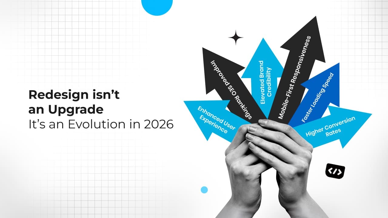
Website redesigning can be your next best sales strategy. It helps enhance the brand presence and keeps it updated per the emerging trends. It also helps rework under-performing website elements for better success.
Effective website redesigning services help a business re-imagine its vision and deliver a more conversion-friendly web presence.
In this blog, we will take you through the basics of website redesigning, what it means for a business, and how it benefits them. We will share result-driven strategies that help boost sales with website redesign.
Let us get started.
The Evolution of Web Design and Its Role in Business Success
From the emergence of the first web page to today, there has been a paradigm shift to creating business-focused web designs. Technological advancements and people’s changing consumer behavior have forced web designs to evolve.
If we revisit the past, website design had its humble beginnings in the 90s. Then, a website was a digital booklet of information. The concept of ‘less is more’ was the norm in websites. They were purely informational, with no proper layout, just headings and sub-content.
After 1996, the introduction of Flash conceptualized visitor-centric website designs. These websites were not mere HTML structures but a merge of interactions and visuals to offer customers an attractive presence. This era introduced animations, backgrounds, neon colors, 3D, and more in website design.
The year 2000 saw the introduction of website usability and flexibility with CSS. It brought creative freedom within the design community.
Today, we are in web design’s modern era. Websites now are an irreplaceable part of business success. To users, the website presence is the most influential point of conversion. What this means is that the experience it offers determines the customer’s final actions. For it to be a positive action, websites must be highly responsive, high-speed, feature-rich, and navigable.
Hence, the website design perspective had to change more and more to meet customer’s changing behavior. If your website is struggling to match user’s expectations and industry trends, you need to know why website redesign is important.
Understanding Website Redesign Service
What is a website redesign?
Essentially, this refers to the process of revamping and overhauling an existing website’s overall structure. Redesigning enhances a website’s aesthetics, functionality, and user experience. This redesign process includes navigation, content, design layout, and format.
It goes beyond superficial changes and involves a strategic approach to align the website with evolving goals, trends, and user expectations. The primary goal of a website redesign service is to boost performance and increase visitor conversion.
There are several reasons for businesses to opt for redesigning services. The redesigning could be a step to rebranding or meeting changed consumer behavior. Businesses sometimes look for redesigning services for SEO purposes and to boost organic traffic.
A successful website redesign process involves a thorough analysis of the current website’s strengths and weaknesses. It entails the identification of the target audience’s preferences and the implementation of design and functionality upgrades. This process aims to add new life to the digital presence and ensures it remains a dynamic and effective tool for achieving business objectives.
The Role of Professional Services in Achieving Effective Website Redesign
Professional website redesign services play a prominent role in delivering effective redesign services. They ensure the revamped website aligns seamlessly with the brand image, business goals, and user expectations. Here are all the prime aspects of a professional website redesign service.
-
In-Depth Strategic Planning and Defining Goals
Website redesign services begin with an in-depth strategic planning phase that serves as the foundation. It includes meticulous analysis of the current website’s performance, user behavior, and industry trends.
Professionals collaborate with clients to identify redesign goals. These goals serve as the road-map and key performance indicators. Design experts suggest tracking metrics of the old website for an adequate comparison to the redesigned one.
-
User-Centric Approach
The most distinguishing factor of professional website redesign services is the unwavering focus on the user experience. For a revamped UI/UX design to perform better, the first step is to understand the target audience.
What are their preferences? How are they interacting with the website?
Professionals focus on creating intuitive navigation and optimizing user flows. They ensure every website element contributes to a positive and seamless user experience. Professional services prioritize the end user and aim to increase engagement, reduce bounce rates, and drive conversions.
-
Content Optimization and Enhancement
Apart from visual upgrades, a successful website redesign involves a thorough examination and enhancement of the website’s content. Professional services include content strategists and copywriters to revamp and reorganize existing content.
They ensure the content aligns with the brand voice and is optimized for search engines (SEO). The upgraded content effectively communicates the brand’s message. The integration of compelling visuals, multimedia elements, and storytelling techniques further enhances the overall impact of the content.
-
Technical Expertise and Optimization
Behind the scenes, professional website redesign services leverage technical expertise to address backend issues. From streamlining code for efficiency to implementing security measures to protect against cyber threats, troubleshooting includes them all.
The technical experts also collaborate to enhance the website’s functionality, improve loading times, and create a stable digital presence. This technical optimization during a website redesign is essential for providing users with a smooth browsing experience.
-
Improvement and Post-Launch Support:
Website redesign is not a one-and-done endeavor. Professional services recognize the importance of continuous improvement of the redesigned structure. Post-launch support is a standard offering inclusive of ongoing monitoring of the website’s performance. It includes tracking key metrics, analyzing user feedback, and identifying areas for refinement.
This commitment to continuous enhancement ensures that the redesigned website remains dynamic and responsive to changing trends. After all, the purpose of the website redesign service is to add value to the business’s web presence and the audience.
In essence, professional website redesign services encompass a holistic and multifaceted approach.
Key Elements of Website Redesign
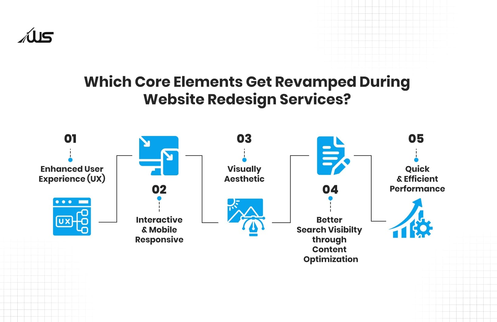
Which Core Elements Get Revamped During Website Redesign Services?
Website redesign improves more than looks. It fixes performance gaps, user experience barriers, and conversion flow issues.Here are the areas that get revamped during when you opt for website redesign services.
User Experience (UX)
Users can move through the site much easier without confusion.
Mobile Responsiveness
Pages display properly on phones and tablets with smoother interaction.
Visual Aesthetics
The brand looks cleaner and more attractive with updated visuals.
Content Optimisation
Content communicates value clearly and supports stronger search visibility.
Performance Improvements
The website loads faster and responds quickly without delays.Website redesign is not merely a visual makeover. As explained before, it involves a strategic overhaul of website elements to enhance overall performance, user engagement, and conversion rates.
Let’s delve into the crucial components of website redesign and explore how each contributes to creating a more compelling online presence.
1. User Experience (UX)
User experience involves the overall interaction a visitor experiences while on a website. It encompasses usability, accessibility, and satisfaction. A user-centric redesign focuses on optimizing this user journey. It involves intuitive navigation, clear calls-to-action, and streamlined pathways that offer visitors a seamless journey through the website.
Enhanced UX leads to increased visitor satisfaction, engagement rate, and lowered bounce rate. It boosts the likelihood of conversion. A well-designed user experience builds trust, encourages exploration, and minimizes user frustration.
2. Mobile Responsiveness
Mobile responsiveness ensures that a website functions and appears seamlessly on various devices, particularly on Smartphones and tablets. With the surge in mobile device usage, a redesign must prioritize responsiveness. It involves adapting layouts, images, and functionalities to different screen sizes, providing a consistent and user-friendly experience across devices.
A mobile-responsive design caters to a broader audience, increasing accessibility. It enhances user satisfaction and positively impacts search engine rankings. Improved accessibility translates to higher engagement and conversion rates.
3. Visual Aesthetics
Visual aesthetics involve the look and feel of a website, including color schemes, imagery, typography, and design elements.
The visual appeal of a website significantly influences first impressions. A redesign process focuses on aligning visual aesthetics with brand identity, conveying professionalism, and meeting the latest digital trends.
A visually appealing website captures attention, evokes emotions, and fosters a positive impression of the brand. Well-designed visuals enhance brand recall and encourage users to explore further, ultimately contributing to increased engagement and conversions.
4. Content Optimization
Content optimization involves refining and enhancing the website’s textual and visual content for users and search engines.
In a redesign strategy, content is repurposed to align with the brand message, target audience preferences, and SEO. It includes updating existing content, incorporating relevant keywords, and ensuring a cohesive narrative.
Optimized content communicates the brand effectively and improves search engine visibility. Engaging, informative content keeps visitors on the site, reduces bounce rate, and supports conversion by providing valuable information.
5. Performance Optimization:
Performance optimization involves improved website speed, reduced load times, and smooth functionality.
Slow-loading websites can cause users to abandon the website and negatively impact search engine rankings. A redesign plan addresses technical aspects, such as code optimization, image compression, and server improvements to enhance overall performance.
A faster website improves the user experience, reduces bounce rates, and encourages users to explore more pages. Websites with a load time of 1 second experience 5x conversion rates than websites taking longer. Additionally, search engines favor fast-loading sites and positively influence visibility and conversion rates.
By strategically enhancing these components, businesses can redesign a website that attracts and engages visitors and effectively guides them toward desired actions. The ultimate goal of the redesign is to improve conversion rates and sales success.

Benefits of Website Redesign
So far, we have a fair understanding of website redesigning and its key components. From a business’s perspective, the redesign plan helps the digital presence stay relevant. The brands that have opted for redesign have experienced heavy traffic boosts and more sales. But how?
Let’s delve into the multifaceted advantages of website redesign in detail and how it increases sales:
1. Enhanced User Experience (UX)
Website redesign aims to optimize the overall user experience even more. It involves making the navigation more intuitive and content more accessible and unique. Businesses that successfully go through website redesign experience a significant boost in user engagement after a redesign.
The design process prioritizes user-friendly interfaces and intuitive navigation. Users are more likely to explore and interact with the site.
An improved UX leads to lower bounce rates, indicating that visitors are staying longer and finding value in the content and functionality of the site.
Enhanced UX also ensures a simplified user journey and increased conversions and sales.
2. Improved SEO Performance
Website redesign provides an opportunity to enhance search engine optimization (SEO) strategies, affecting a site’s visibility on search engine results pages.
Strategic SEO improvements, such as keyword optimization, improved site structure, and mobile responsiveness, contribute to higher search engine rankings. These facilitate organic position post-redesign.
Improved SEO not only attracts more traffic but also targeted traffic. It leads to higher conversion rates and attracts visitors with genuine interest in their products or services.
3. Elevated Brand Credibility
A website is the first point of contact between a business and its audience, making credibility a crucial aspect of redesign.
A visually appealing and well-organized website enhances the overall perception of a brand. Users trust and engage with a business that invests in a professional and modern online presence.
Trustworthy and credible websites are more likely to convert visitors into customers and experience increased sales.
4. Enhanced Accessibility
Accessibility ensures all users can easily navigate and interact with the website without hindrance and friction. It also includes users with disabilities.
A redesigned website with improved accessibility features expands the reach to a broader audience, including individuals with visual or motor impairments. This inclusivity aligns with ethical considerations and broadens the potential customer base.
5. Integration of Advanced Technologies
Website redesign provides an opportunity to integrate the latest technologies, enhancing functionality and user engagement.
Incorporating advanced features like chatbots, virtual assistants, or interactive elements can significantly enhance user engagement. Businesses that embrace innovative technologies experience increased user interaction and satisfaction.
6. Alignment with Industry Trends
The digital landscape is dynamic, with design and functionality trends constantly evolving.
A redesigned website aligned with current industry trends provides a competitive edge. Businesses that stay ahead of the curve will attract and retain more visitors, showcasing a commitment to innovation and relevancy.
A modern website design contributes to the perception of a forward-thinking and adaptive brand, positively influencing customer trust and loyalty.
7. Streamlined Conversion Funnels
The conversion funnel represents the users’s journey on a website. This begin right from when they enter the site to when they complete a desired action. In most cases, the ultimate conversion is sales.
A strategic redesign often involves optimizing and streamlining the conversion funnel. After a successful website redesign, businesses experience increased conversion rates. Redesigning ensures the path from initial interaction to conversion is clear, concise, and user-friendly.
All these benefits of website redesign finally lead to increased sales and satisfied customers. Let us have a look at how to utilize redesign and boost sales:
Boosting Sales through Website Redesign
A strategic website redesign service is pivotal to optimizing the user experience and driving sales growth. Apart from improved first impressions, statistical evidence underscores the significant impact of website redesign on revenue generation.
Businesses that undergo a comprehensive website redesign experience an average revenue increase of 10-20%. This statistic highlights the correlation between an improved online presence and financial success.
Analysis of the e-commerce market reveals websites that prioritize UX through redesigns tend to observe an increase of 30% in online sales within the first year. This highlights the tangible returns on investment of a website redesign service.
Strategies to Leverage Website Redesign for Sales Growth
| Strategy | What It Means | Why It Converts Better |
| Conversion Focused Layout | Clear CTAs and simpler visitor actions | Helps visitors decide faster and buy faster |
| User Journey Mapping | Finding and fixing user pain-points on the website | Makes browsing smoother so more people reach the checkout page |
| Mobile First Design | Designing sites for phone users first | Boosts sales because most shoppers browse on mobile |
| Personalised Experience | Displaying content based on visitor behaviour | Feels more relevant which boosts trust and buying intent |
| Faster Checkout | Reducing steps and friction during payment | Cuts cart abandonment and increases completed orders |
The success of a website redesign in boosting sales hinges on the strategic implementation of key tactics.
1. Conversion-Optimized Design
Conversion-optimized redesigning involves meticulous placement of calls-to-action (CTAs). It must also simplify the checkout process and create visually compelling product pages.
Conversion-centric redesign structures often witness a notable improvement in conversion rates. For instance, a well-placed personalized CTA can result in a 15% increase in click-through rates, directly contributing to heightened sales.
2. User Journey Mapping
Understanding and optimizing the customer journey is imperative. User journey mapping during redesigns involves identifying and addressing friction points to create a seamless user experience.
By smoothing out the path from initial interaction to conversion, users are more likely to progress through the sales funnel, positively impacting overall sales.
3. Mobile-First Approach
The United States is home to 310 million Smartphone users. With such an expansion of mobile device usage, a mobile-first redesign is paramount. It ensures the website is optimized for a seamless experience on smartphones and tablets.
Businesses with mobile-responsive websites experience a 20% increase in mobile sales. A mobile-first approach directly caters to user preference, resulting in a boost in sales from mobile devices.
4. Personalized User Experiences
Implementing personalization features based on user behavior enhances the overall user experience. 69% of users appreciate a personalized browsing experience while on a website (provided it’s taken from data that the visitors themselves have shared). And user-satisfaction leads to higher conversion rates and increased sales.
Personalization fosters a sense of connection and relevance. It is a key factor in enhancing credibility among users. And with redesigning, the scope of personalization is heightened and improved. Businesses can make a sound decision by understanding what level of personalization works and which do not.
5. Streamlined Checkout Process
A complex or lengthy checkout process can contribute to cart abandonment. Redesigning to streamline the checkout process, including one-click purchasing options, can significantly reduce friction.
Businesses optimizing the checkout process through redesigns experience a 35.26% reduction in cart abandonment rates. A simplified checkout process directly translates into more completed transactions and increased sales.
By strategically implementing these tactics during the redesign process, businesses can unlock the full potential of their online presence, creating a pathway to sustained sales growth and enhanced e-commerce success.
Why Businesses Need Website Redesign in 2026
Let’s assume you have a visually appealing website crafted to meet design trends and user needs. But that was ages ago, right?
The digital world is constantly evolving to offer the best experience to users. Several innovations have taken center stage, be it artificial intelligence, augmented reality, and sustainability.
In terms of website design, the year 2026 will experience some dominant design trends. A few of them are microinteractions, scroll-triggered animations, Glassmorphism (Liquid Glass texture), Neo-Brutalism, Flat designs with a blend of Skeumorphism.
As a business owner, analyze your current website structure. Does it meet the digital and visual benchmarks required for a competitive edge? Is your website future-ready?
Here is where website redesign comes into play. Evolution in this domain is inevitable; the key to success is adaptation. And in this case, redesigning to meet the changing website design landscape.
To make it easier to identify the need to redesign, here is a list of website red flags. If your business matches with any, it is recommended to go for a website redesign service.
1. The website has an outdated design structure
An outdated website design is detrimental to digital success. Such a design entails several negative attributes such as slow pages, responsiveness issues, disordered layout, etc. These cumulatively create frustration among users and convince them to abandon a website.
Redesigning ensures the website structure does not compromise user expectations and industry needs.
2. The website is experiencing an increased bounce rate/low engagement rate
Several minute factors add to the overall engagement rate. Such as lack of informative content, slow website loading, non-responsive website, critical navigation, etc. Each factor forces away a potential visitor and increases the bounce rate.
Website redesigning services ensure turning an existing website into a compelling reinforced with micro-interactions and engagement points.
3. The website is difficult to navigate from the visitor’s POV
Navigability is another factor that can severely impact a website’s success. Poor navigability leads to a negative user experience. It further leads to an increased bounce rate, website abandonment, and an adverse impact on search engine rankings.
As best practices before starting with a redesigning plan, reputable web design agencies begin by engaging with the website as a visitor. This approach offers a first-hand experience of how the website performs in navigability.
4. The website content is underperforming
Design and content collate together to offer a powerful digital presence. Outdated content, in contrast, has adverse effects which results in low visibility and low engagement. You should know that content written ages ago or subpar and irrelevant information is also considered outdated content.
As mentioned earlier, apart from redesigning a website’s visual structure, large-scale website designing agencies cover multiple facets of website redesign. It includes content overhauling as well. It means restructuring content with relevant keywords, maintaining SEO structure, and aligning to the brand’s voice.
5. The website is not mobile-responsive
Mobile-responsive is crucial to survive today’s digital landscape. 92% of the internet users use a mobile to browse the internet. Having a non-responsive website means not having a digital presence that appeals to this 92%. This non-responsiveness leads to substantial traffic and revenue loss for a business.
Website redesigning service from a reputable web design agency prioritizes mobile-friendly websites and design layouts that improve user interaction.
If your business website is struggling with any of the above, it needs a website redesigning service. Website redesigning has the transformative potential to counter these hindrances and make a website competitive.
A well-executed web redesign plan must cater to the needs of the customers, the search engine, and the evolving digital space. All of this welcomes high volumes of traffic and sales.
Your Turn to Avail Website Redesign Service
Although tedious, website redesigning is a fun process to elevate your digital presence. When done right, it has proven to improve conversion rate and bring in sales.
For a business to grow substantially in the coming year, it is essential to invest in website redesigning services. Redesigning will play a distinguishing part in allowing brands to stay ahead amidst competition.
Before hiring a professional team to help in redesigning, begin with self-analysis. It is necessary to understand your website’s strengths and weaknesses. It is crucial to understand the consumers and their behaviors.
These insights will help you and the experts devise the best redesigning structure for guaranteed success.
Need a website redesign agency to guide you?
Webskitters Technology Solutions Pvt. Ltd. has got you covered. With a seasoned team of website designers, we aim to offer the best website redesign service. With years of expertise, our premium redesigning services adhere to industry standards and utilize best-of-the-market tactics to drive maximum sales.
Begin The Redesigning Journey Today!

 UI/UX Design
  Web Development
  Mobile App Development
  Internet Of Things
  Game Development
  Artificial Intelligence
  Digital Marketing
  Data Science Consulting