 October 5, 2026
 A polished store can still lose most of its buyers at the cart. If you sell on Shopify, or you work with a Shopify development team on conversion, the fastest way to reduce cart abandonment is to remove doubt at the moments that matter.
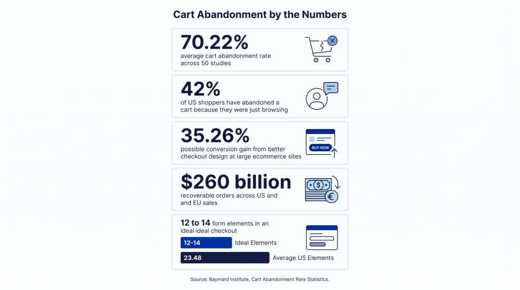
The numbers are blunt. Baymard Institute puts the average cart abandonment rate at 70.22%, based on 50 separate studies. Not every one of those carts was a lost sale. Some shoppers were only comparing prices. But a large share left because they doubted something: the total cost, the site, or the process.
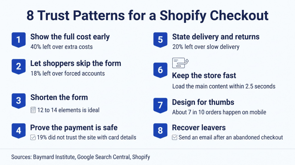
Below are eight UX patterns that rebuild confidence. Each one names the problem, the fix, and where to make the change in Shopify.
What Is a Normal Cart Abandonment Rate?
The average documented cart abandonment rate is 70.22%. The formula is simple: carts created minus completed purchases, divided by carts created, times 100.
Zero is not a realistic goal. In Baymard’s survey, 42% of US shoppers said they had abandoned a cart because they were just browsing or not ready to buy. Those exits are normal.
The rest is where you can win. Baymard estimates that better checkout design could lift conversion by 35.26% for the average large ecommerce site. Across US and EU sales, that equals about $260 billion in recoverable orders. Those figures come from large retailers, so treat them as direction, not a promise for your store.
Why Do Shoppers Abandon Carts?
Most fixable reasons come down to cost, trust, and effort. Baymard asked US shoppers why they left, setting aside the browsers. Here is the ranking, matched to the pattern that answers each reason.
Read the table for what it says about trust. Only two of the ten reasons are about price itself. The rest are about confidence, speed, and effort.
| Reason for leaving | Share of shoppers | Pattern that helps |
|---|---|---|
| Extra costs too high (shipping, tax, fees) | 40% | Pattern 1 |
| Delivery was too slow | 20% | Pattern 5 |
| Did not trust the site with card details | 19% | Pattern 4 |
| Site wanted an account | 18% | Pattern 2 |
| Checkout too long or complicated | 17% | Pattern 3 |
| Site errors or crashes | 17% | Pattern 6 |
| Returns policy was not satisfactory | 13% | Pattern 5 |
| Could not see total cost up front | 12% | Pattern 1 |
| Credit card was declined | 10% | Pattern 4 |
| Not enough payment methods | 9% | Pattern 2 |
8 UX Patterns That Reduce Cart Abandonment on Shopify
Pattern 1: Show the Full Cost Before Checkout
The problem: 40% of shoppers who left cited extra costs. Another 12% could not see the total up front.
The fix: Show shipping and tax expectations on the product page and again in the cart. Add a shipping estimator to the cart, and state your free shipping threshold in plain text. Depending on your theme, this takes a small edit or a lightweight app.
Cross-border orders add duties and longer delivery, so state both early. These tips for selling internationally on Shopify cover the planning side.
Pattern 2: Let Shoppers Skip the Form
The problem: 18% left because the site wanted an account. Another 9% found too few payment methods.
The fix: Make guest checkout the default and put accelerated wallets at the top. In Shopify, turn on Shop Pay, Apple Pay, and Google Pay in your payment settings. A study Shopify commissioned found that Shop Pay converts up to 50% higher than guest checkout. That is a vendor figure, so read it as a ceiling, not a forecast.
Shopify’s 2026 data also shows an average order value about 16% higher on Shop Pay, at $119.37 versus $102.65. Offer account creation after the order, not before it.
Pattern 3: Shorten the Checkout Form
The problem: 17% abandoned a checkout that felt too long or complicated. Baymard’s testing shows an ideal checkout needs 12 to 14 form elements. The average US checkout shows 23.48.
The fix: Remove every field you do not use. In your Shopify checkout settings, hide the company name field and make address line 2 optional. Keep the phone number optional unless your carrier requires it. Baymard says most stores can make a 20% to 60% reduction in form elements without losing information they need.
Pattern 4: Prove the Payment Is Safe
The problem: 19% did not trust the site with their card details. Another 10% had a card declined.
The fix: Make the payment step look familiar. Show recognised wallet and card logos near the pay button. Explain in one plain sentence what happens if something goes wrong. Skip decorative badges. A badge should point to a real protection, such as a guarantee or a secure payment provider. Offer more than one method, so a decline does not end the sale.
Pattern 5: State Delivery and Returns Where Doubt Starts
The problem: 20% left over slow delivery. Another 13% were unhappy with the returns policy.
The fix: Put a delivery window on the product page and repeat it in the cart. Add a two-line returns summary beside the add-to-cart button, with a link to the full policy. Be specific. “Delivered in 3 to 5 working days” beats “fast shipping”. If you cannot keep a promise, do not print it.
Pattern 6: Keep the Store Fast and Stable
The problem: 17% left after site errors or crashes.
The fix: Hold your pages to Google’s Core Web Vitals targets. Largest Contentful Paint should land within 2.5 seconds. Interaction to Next Paint should stay under 200 milliseconds. Cumulative Layout Shift should stay below 0.1. Every app adds scripts, so audit them and remove what you do not use. A clean theme build helps more than another plugin, which is where ecommerce development support pays off.
Pattern 7: Design the Checkout for Thumbs
The problem: Shopify’s 2026 Shop Pay data puts about 7 in 10 orders on mobile. A checkout built for a mouse loses those buyers.
The fix: Test the full flow on a real phone. Use large tap targets and the right keyboard for each field, such as a numeric pad for phone and card numbers. Keep express wallets above the form. Make the order summary collapsible, so the pay button stays in reach.
Pattern 8: Recover the Shoppers Who Still Leave
The problem: Even a strong checkout loses buyers.
The fix: Follow up. Shopify can send an email automatically after a shopper abandons checkout, and you can track recovery status in the admin. Recovery only starts once a shopper has entered an email address, so ask for it early. Write the message as a reminder, not a pitch. Show the product, the delivery promise, and the return terms. Add a discount only if your margin can bear it.
Which Shopify App Store Tools Help Reduce Cart Abandonment?
Start with what Shopify already includes, then add apps only for real gaps. Shopify’s own abandoned checkout recovery listing shows that built-in recovery covers email reminders, while exit pop-ups and retargeting ads are not included.
| Recovery need | Built into Shopify? | What to check |
|---|---|---|
| Email reminders | Yes, included | Timing, wording, and a direct link back to the checkout |
| Exit pop-ups | No, needs an app | Load impact on mobile pages |
| Retargeting ads | No, needs an app | Ad spend limits and privacy consent settings |
| SMS reminders | Offered by apps | Opt-in rules and message frequency |
Check three things before you install anything. First, confirm the app works with Checkout Extensibility, the framework Shopify now uses for checkout customization. Second, compare page speed before and after. Third, place one test order through Shop Pay, because extensions and tracking can behave differently in that flow.
How Do You Know a Change Worked?
Measure completion, not clicks. Track the share of started checkouts that end in an order, and split the result by mobile and desktop. Change one thing at a time, so you know which fix earned the result.
Shopify’s Abandoned checkouts report lists each incomplete checkout and its recovery status. If your store has low traffic, make one change, wait a few full weeks, and compare.
Where to Start This Week
Pick the pattern that matches your biggest leak. If shoppers leave at shipping, start with pattern 1. If mobile completion trails desktop, start with pattern 7.
If you want a second pair of eyes, a team that builds Shopify stores every day can find drop-off points quickly. You can hire dedicated Shopify developers from Webskitters to audit your checkout and ship the fixes.
Frequently Asked Questions
What is a good cart abandonment rate for a Shopify store?
Shopify does not publish an official benchmark. The best public reference is Baymard’s 70.22% average across ecommerce. Because 42% of shoppers abandon while just browsing, aim to beat your own baseline rather than zero.
Does Shop Pay reduce cart abandonment?
Shopify’s commissioned study says Shop Pay converts up to 50% higher than guest checkout. Simply showing it lifted lower-funnel conversion by about 5%. These are vendor figures, so test the result in your own store.
What is the difference between an abandoned cart and an abandoned checkout?
An abandoned cart means the shopper added items and left. An abandoned checkout means the shopper started checkout and did not pay. Shopify’s recovery emails target abandoned checkouts, and Shopify deletes them from the admin after three months.
How many fields should a checkout have?
Baymard’s testing shows an ideal checkout can use 12 to 14 form elements, or 7 to 8 fields. The average US checkout shows 23.48 elements. Remove anything you do not need to ship or bill.
Do I need Shopify Plus to improve checkout UX?
Not for most fixes. Guest checkout, Shop Pay, form settings, speed work, and recovery emails do not depend on it. Deeper layout changes to the checkout steps rely on Checkout Extensibility, and some need Plus. Confirm current plan rules in your admin before you commit.

 UI/UX Design
  Web Development
  Mobile App Development
  Internet Of Things
  Game Development
  Artificial Intelligence
  Digital Marketing
  Data Science Consulting