

 April 21, 2026
 Design trends may come and go, but what remains is consistency. That is why strong UI design is the bedrock of well-loved products.
You may remember Skeuomorphism, the hyper-realistic design of websites and apps that were all the rage in the early 2010s.
Where are they now?
Considerable usability issues forced them to die out or evolve.
This just goes to show that though you may have your finger on the pulse of the current design trends, it may not be enough.
Certain foundational UI design standards need to be maintained to ensure that an app, a site, a dashboard, or any other product can achieve its intended goals.
This is the secret behind the success of brands like Spotify, Notion, and Airbnb. If you have used these products, you know firsthand how well they perform and how easy it is to use them.
These top brands have gone through great pains to make the baseline user interface of their products smart and consistent.
To make sure the products you design don’t overlook key UI standards, here is a handy checklist that you can use.
First, let’s see why you should pay attention to UI design consistency.
Why does UI Design Consistency Matter?
The reason why UI design consistency is emphasized is that it directly impacts user experience, usability, and brand trust. In a digital interface, it ensures minimal cognitive load by creating predictable interfaces (visual, functional, internal).
The ultimate goal of UI design consistency is to make life easier for the user.
If you want a broader idea of the full scope of web design, check out Web Design: A Complete Guide to Modern, High-Converting Websites in 2026
Note: It is important to realize that the below are guidelines or best practices if you will, and they are not set in stone. In certain cases you may need to customize things according to specific needs or user preferences and go against what is said here. Good discernment will go a long way in this case.
Checklist of UI Design Principles for Efficient Products
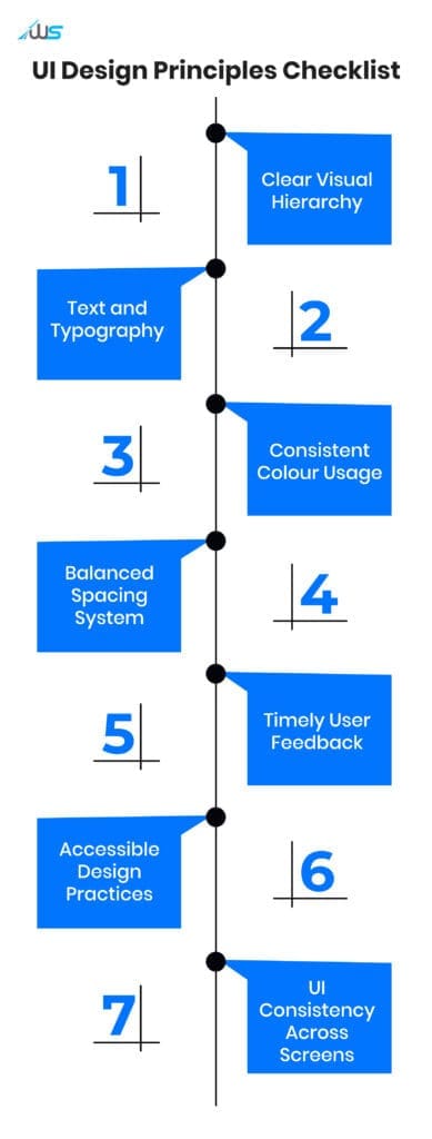
Now that you know the importance of consistency in UI design, we will go through the proven UI principles that expert designers follow.
If you are a new designer, you can also learn about Web Design vs. UI UX: Are Web Design and UI UX the Same?
Before you start designing anything, these are the UI principles you can check.
1. Hierarchy
Each page/screen of a digital product will have certain elements that are more important than the other elements. So, it’s natural to emphasize or differentiate those parts through visual cues, including:
-
Spacing
-
Font size
-
Contrast
A visitor should be able to just glance at the page and be able to tell where the key information is and what the desired actions are.
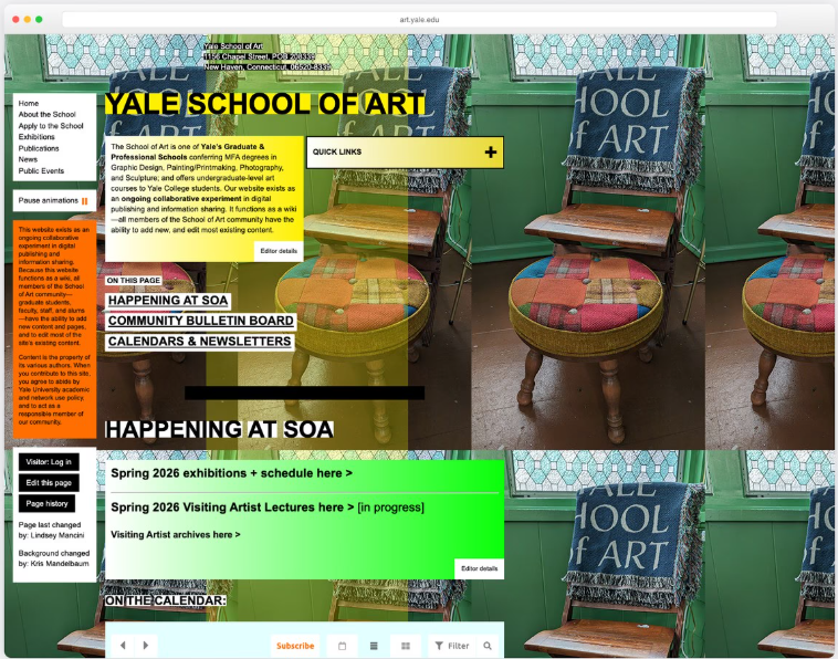
The Williams Sonoma site is an example of ‘what not to do’ when it comes to visual clarity.
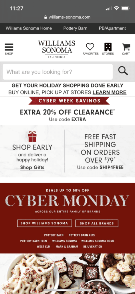
The unofficial rule is “one page, one goal”. So, say you are creating a ‘home’ page, you need to distill things down to one basic action you want visitors to take, like ‘schedule a call’.
Another trick is to position the important information in the top-left, as that is where a good number of your visitors glance first.
2. Text and Typography
It’s obvious that if you make all the text on the page bold, the user will not be able to focus on the key elements.
Parts, including buttons, links, headers, and subheaders, can be differentiated from the body text. Designers usually achieve this through white space, font weight, size, and/or color.
Because it is a default for most browsers, the body text of websites and apps needs to be a standard 16px to ensure readability and accessibility.
On webpages, particularly, heading levels go from H1 to H6 to offer a clear and logical structure. Here, H1 is the main page title, while H2-H6 are for sub-sections and granular sub-sections.
| Level | Size (px) | Use |
|---|---|---|
| Display | 36–64 | Hero / landing |
| H1 | 32–48+ | Page title |
| H2 | 24–34 | Main sections |
| H3 | 20–24 | Subsections |
| H4/H6 | 16–18 | Minor labels |
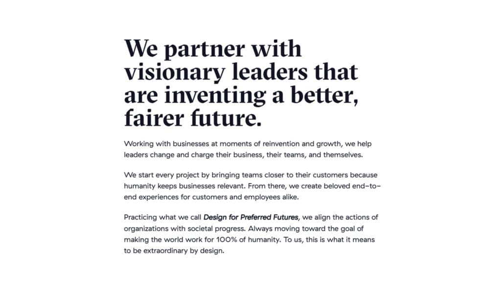
Generally, only one to two font families are preferred per digital interface to maintain a pleasing aesthetic of the page.
What you see below is the classic practice of pairing a serif headline with a sans-serif body text.
3. Colors
People tend to react almost instantly to the colors (and often unconsciously) of a UI design.
We won’t bore you with the details of color psychology, but suffice it to say that it impacts user trust and confidence.
Wouldn’t it be jarring to see a red button on one page and a yellow one on another?
What works well is choosing a consistent and simple color scheme that creates a hierarchy that is effortless to understand.
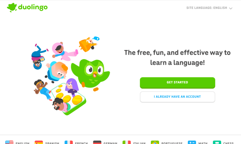
Duolingo does this well by using vibrant colors to create a friendly, engaging aesthetic that suits their message.
How To Pick Colors For Your UI
Primary color: This would be the color that represents your brand (typically based on your brand logo). You would mostly use it for key actions like main buttons and highlights.
Secondary color: The supporting color you choose should complement the primary one. It will be used for less critical elements and structure.
Accent/Supplementary colors: The accent color needs to be used sparingly. It can draw attention to specific actions, alerts, or important details without overwhelming the interface.
4. Spacing
The white space or ‘negative space’ that you see on a portal, software, and apps, etc., serves a function, and it is not just there accidentally.
You may have experienced the cognitive load that comes with opening a cluttered, element-heavy webpage (check the webpage below) or app screen.
To ensure the visitor’s brain is not assaulted with information, you can use negative space, margins (outside), padding (inside), and gutters (between items).
Types of Spacing for Interfaces
Micro spacing affects readability and usability
-
Line height (text readability)
-
Space between icons and labels
-
Padding inside buttons
Macro spacing controls overall flow and structure
-
Space between sections
-
Page margins
-
Distance between content blocks
5. Feedback
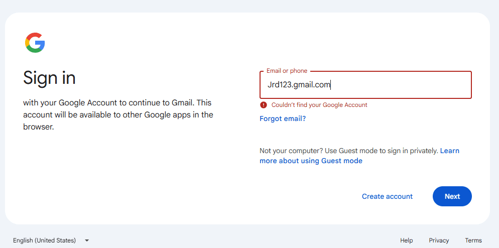
Users need visual cues (a.k.a feedback) that confirm that the interface has registered their actions like ‘add to cart’, ‘submit form’, or ‘apply filters’.
When you try to sign in to a Gmail account and you enter the incorrect password, you don’t just get a frozen or white screen in response. The UI design includes an error feedback message that informs you of the mistake rather than leaving you in confusion.
Feedback Types
The beauty of smooth feedback mechanisms is that they don’t intrude upon your experience, but they work in the peripheries to ease your journey on a digital interface.
There are various types of feedback that you can include in your UI design.
Error feedback: When something goes wrong, the system clearly explains the issue and how to fix it.
Progress feedback: The system shows ongoing activity so you know something is happening without guessing or waiting blindly.
Confirmation feedback: After completing an action, the system reassures you that it worked, so you don’t repeat it.
Instant feedback: The system responds immediately to your actions, making interactions feel fast, smooth, and predictable.
6. Accessibility
Each user’s level of ability will differ. Accordingly, your interface needs to be reflected and accommodate the various requirements to allow people to navigate with ease.
By adhering to the standardized WCAG (Web Content Accessibility Guidelines), your product will be designed in an inclusive and accessible way.
A person with low vision may want to use a bank app. They would obviously find it nearly impossible to read text that does not sufficiently contrast against the background color. The blurry appearance may cause them to make serious errors.
Core Web Accessibility Principles (WCAG)
Keeping the acronym POUR in mind, designers get a handy set of guidelines to help them ensure that their products offer a rich experience to people of all abilities.
| Principle | What it means | Example |
|---|---|---|
| Perceivable | Content is visible and understandable through text, visuals, or assistive tools | Alt text, captions |
| Operable | Users can navigate and interact using keyboard or other input methods | Keyboard access |
| Understandable | Content and interactions are clear, predictable, and easy to follow | Clear labels |
| Robust | Works reliably across devices, browsers, and assistive technologies | Screen reader support |
7. Consistency
It is not possible for digital interfaces to offer consistency without a well-defined (single source of truth) design system. The human mind tends to trust familiar patterns, so inconsistency would be jarring.
According to Figma, you can achieve 34% higher design efficiency if you have a well-maintained design system.
Thanks to this framework, all the UI components, styles, and guidelines are standardized to offer a uniform look and feel.
Suppose you have designed a mobile app with a bottom-tab bar for navigation, but a navigation drawer (hamburger menu) on the desktop web version. Your users will be understandably confused when they switch between devices.
How to Create Consistency in UI Design
-
Build a clear style guide
-
Keep reusable patterns organized
-
Review, test, and refine regularly
Ensure Fool-proof UI Design with Webskitters
Even in the most ideal scenario, the UI of your product is not going to please everyone. That said, if your cover your bases using this UI design checklist, you are already halfway there and all that’s left is to straighten out any inconsistencies.
If you are looking for ways to improve your product’s UI design, Webskitters can assist you. Our seasoned team adheres to key UI design principles, crafting products that people will love to use.
To get started, schedule a call with Webskitters’ top experts.
Frequently Asked Questions
What are the 7 principles of UI design?
The main principles include hierarchy, consistency, feedback, accessibility, spacing, color, and typography. Together, they help you create interfaces that feel clear, usable, and easy to navigate.
What makes a good UI design?
A good UI design feels simple to use without explanation. You can quickly understand where to click, what to read, and how to move forward.
Why is consistency important in UI design?
Consistency helps you learn the interface faster. When buttons, colors, and layouts behave the same way, you don’t have to relearn actions on every screen.
How does color affect user experience in UI?
Color guides your attention and signals actions or states. The right colors make things clear, while poor choices can confuse you or make you leave quickly.
What is the role of feedback in UI design?
Feedback tells you what’s happening after you act. It confirms clicks, shows loading, or highlights errors, so you’re never left guessing what the system did.

 UI/UX Design
  Web Development
  Mobile App Development
  Internet Of Things
  Game Development
  Artificial Intelligence
  Digital Marketing
  Data Science Consulting


