
 March 18, 2026
 Have you designed an extraordinary website that is fast and looks great, but isn’t getting the ranking or traffic it needs? The lack of incorporation of web design techniques might be the issue with your site.
Having a responsive website isn’t optional anymore; it’s mandatory. We live in a world where we have developed filtering mechanisms that let users scan quickly. And if your site isn’t responsive, users will abandon it in no time.
But what does a responsive web design do?
Responsive web design services enable websites and apps to adapt seamlessly to different screen sizes, ensuring accessibility and a consistent experience across devices. Unlike mobile-first design, which primarily focuses on smartphones, responsive design adapts layouts to fit a range of devices, screen sizes, and resolutions. With the rapid growth of smartphone usage in 2026, responsive design has become essential for improving user experience, loading speed, and business conversions.
Let’s explore all that and more. But first, we need to understand the importance of modern web design in businesses.
How Web Design can help your Business?
Let’s not beat around the bush. Web design is, certainly, the most important aspect of your digital presence. Your website or app is the first point of contact between your business and users. So, exceptional web designs can create unforgettable first impressions. This can positively impact your business’s success in the digital arena.
An engaging, interactive web design can keep users engaged, which in turn increases the chances of conversions. Along with that, intuitive navigation, one of the most important parts of effective design, can guide them to take the desired actions.
Without all these, your business is bound to fail in the highly competitive digital landscape. Let’s discuss four major reasons why web design can make or break your business.
1. Engagement and User Experience
Good web design always invites users to interact with your website content for information. With an intuitive navigation, clear layout, and aesthetic elements, your users will spend more time on the website and engage with it.
This increased interaction isn’t only for conversions but also important for establishing a relationship with the prospects. A great web design can increase engagement and guide users through an exceptional user experience.
2. Conversions and CTAs
In 2025, overall website conversions dropped by 6.1%. This shows how volatile the conversions are right now. Your web design doesn’t just need to be good; it needs to be great to convert.
Let’s face it: the ultimate business goal is conversion. A well-designed website can help you achieve that. Web design is a major factor for Conversion Rate Optimization. For conversions, call-to-actions play a critical role. Its placement, visibility, and accessibility all play an important role in enhancing the conversions.
Certain elements can increase user trust. For instance, adding testimonials, certifications, and case studies can build user confidence. This user confidence can help you achieve conversions.
And, the third major thing is the responsiveness and load speed. We will get to these in detail in the next section.
3. Credibility and Trust
Your site isn’t only your showroom for your products or services; it is also the brand ambassador. With its design, you can effectively communicate your values and messaging.
You have to understand that each UI element in the web design evokes certain emotions in users and subtly conveys messages. Be it fonts, color schemes, menus, or CTAs, each element shapes your brand’s overall identity.
4. Search Engine Optimization
Most importantly, if your website isn’t ranking on the SERPs, your investment in a digital transformation is a waste of time and resources. Most people click on websites ranking on the first page. That’s why your web design should align with SEO best practices.
A structured web design is always advantageous, as it can be easily crawled by search engines and LLM crawlers. This allows them to index and rank your content based on relevant user queries.
Learn more: Web Design: A Complete Guide to Modern, High-Converting Websites in 2026
Now that we know all about how an outstanding web design can help your business, let’s shift our focus to responsive web design.
What is Responsive Web Design?
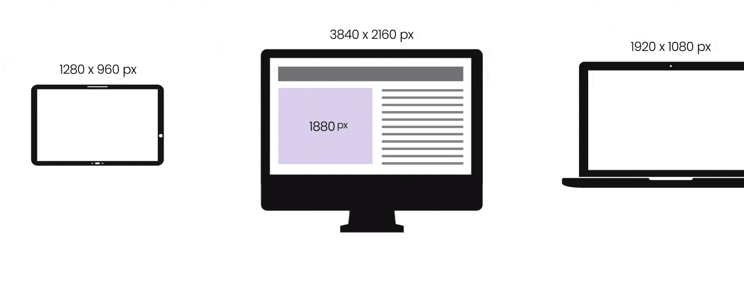
Responsive web design means that the design of an app or website can adapt to any screen size or device without compromising its quality or accessibility.
A responsive web design is certainly the need of the hour right now. And that’s why responsive web design techniques are becoming increasingly popular in digital transformations.
Data suggests that 74% of users are likely to visit a site if it has incorporated responsive web design techniques. A responsive site loads quickly and makes sure every element is accessible from any device.
As responsive web design enhances the user experience, it boosts conversion rates by guiding users to take the desired action.
Mobile-First Web Design vs Responsive Web Design
These two terms are, more often than not, used synonymously. But they have different meanings altogether.
Mobile-first web design is the approach that makes a site or app responsive only to mobile devices. It is quite obvious that most of your users are on smartphones. In 2026, the number of smartphone users stood at 5.78 billion, representing 69.64% of the world’s population. So, a mobile-first design makes sense.
However, responsive web design techniques take a broader approach.
A responsive site adapts its layout according to the device on which it is browsed. It fits the device’s orientation, screen size, and resolution. Instead of layout shrinkage, it reorganizes the layout for a particular device.
Each responsive site is mobile-friendly, but every mobile-first site isn’t responsive. This difference becomes increasingly apparent as layouts become more complex.
Why Responsive Web Design Matters for Businesses in 2026?
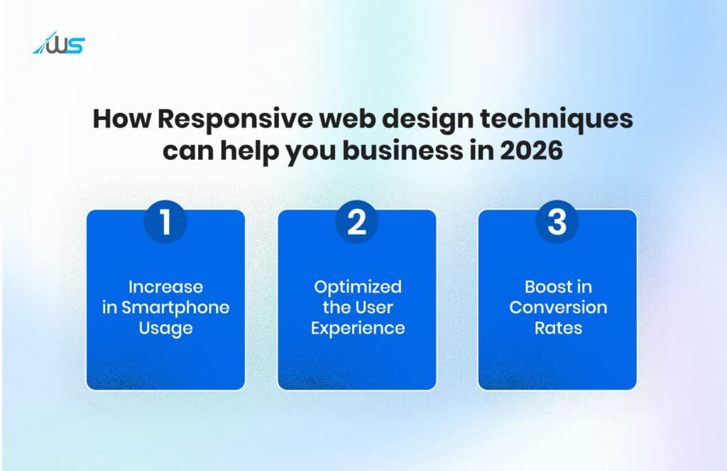
1. Increase in Smartphone Usage
As more people adopt smartphones and tablets for browsing the internet, demand for cross-device compatibility is rising significantly.
Incorporating responsive web design techniques automatically resizes layouts based on screen size, making the mobile browsing experience seamless and smooth.
2. Optimized the User Experience
When done correctly, responsive web design ensures the app or site is user-friendly and provides a consistent experience across devices.
First-time visitors are more likely to return to your site or app if it is optimized to work effortlessly on all devices. Responsive layouts improve satisfaction, leading to return visits that nurture relationships and garner user trust.
3. Boost in Conversion Rates
GoodFirms found that around 73% of designers agree that a non-responsive web design is one of the primary causes of visitors abandoning websites. A non-responsive website makes users zoom and scroll horizontally to access content. This leads to a negative user experience.
Responsive web design techniques ensure that all these things are eliminated and a consistent experience is delivered. This exceptional UX can significantly increase brand loyalty and boost conversions.
Are there any challenges to developing a Responsive Web Design?
While these responsive web design techniques offer significant benefits, they also pose certain challenges during implementation. Let’s explore some of them.
1. Common Pitfalls
Even with all the advantages, certain common mistakes need to be avoided:
-
Ignoring a mobile-first web design
-
Failure to identify the need for load times
-
Neglect cross-device compatibility
2. Technical Obstacles of the Responsive Web Design Technique
As designing a responsive site involves web development as well, technical challenges are bound to appear:
-
Media breakpoints and queries for different screen sizes can be challenging
-
Media and Image optimization that loads and resizes effectively
-
Handling of code to transform a non-responsive layout into a responsive one with modern design standards
3. Aesthetics vs Performance
Balancing a site’s aesthetics with its performance is crucial for exceptional UX. However, it isn’t as easy as it seems. High-quality animations and images, along with complex CSS, can make your site more appealing. But they can slow down your site, especially on weak mobile networks.
So, there’s a need to optimize the site for aesthetic appeal without compromising performance.
Without Responsive Web Design, Your Business Might Fail
Responsive web design can make or break your business. On the one hand, it makes your site usable and accessible. On the other hand, it increases your rankings and user satisfaction. All these are paramount for any business that wants to thrive in the online space.
If you think it’s optional, it isn’t; responsive web design is a staple in contemporary web design. No matter how great your site looks or feels. If your site isn’t compatible with different devices, it will harm the user experience.
Do you want to learn more about responsive web design techniques or the steps you should take? We are here for you.
Book a call with us and make your website as awesome as your business.
FAQs
-
What is responsive web design?
Responsive web design is an approach that allows websites to automatically adapt to different screen sizes and devices.
-
How is responsive design different from mobile-first design?
Mobile-first design prioritizes smartphones, while responsive design adapts layouts for all devices and screen sizes.
-
Why is responsive web design important for businesses?
It improves user experience across devices, helping businesses retain visitors and increase conversions.
-
How does responsive design affect website performance?
A well-implemented responsive design ensures faster loading and smooth navigation on different devices.
-
What are some common challenges in responsive web design?
Challenges include managing media queries, optimizing images, and balancing visual appeal with site performance.
 UI/UX Design
  Web Development
  Mobile App Development
  Internet Of Things
  Game Development
  Artificial Intelligence
  Digital Marketing
  Data Science Consulting


