
 June 5, 2026
 If you check Baymard’s cart abandonment data, a painful reality emerges. Shoppers can reach the cart, show clear buying interest, and still leave before completing the purchase. Its 2026 benchmark puts average documented cart abandonment at 70.22%.
It’s clear that many lost sales are not caused by lack of interest. They happen when the website does not answer questions, remove hesitation, or make the next step easy enough.
The right website features help visitors move from interest to enquiry, booking, or purchase with less confusion. For any business working with a web development company in Kolkata, this is where better website planning can directly support stronger conversions.
Why Website Features Matter for Conversions and Sales
Website features matter because visitors rarely arrive ready to act without checking details first. When it comes to links, forms, chat, reviews, and product pages one need keeps surfacing. People should be able to understand options, compare information, and complete actions without unnecessary effort.
Good conversion features help with:
-
Finding the right information
-
Contacting the business
-
Comparing choices
-
Trusting the page
-
Completing the next step
They are practical parts of the website, not decorative additions.
How a Conversion-Focused Website Guides Visitors Toward Action
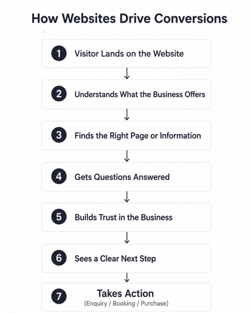
A conversion-focused website gives visitors enough direction at the moment they need it.
Clear labels help them know where a link will take them. Well-placed contact options help them ask questions without searching through multiple pages. Reviews, trust marks, and detailed service information help them check whether the business is credible.
Stanford’s web credibility guidelines also say that clear contact information, real organization details, and easy-to-use websites support trust.
There’s no point in trying to push every visitor into the same action. What you need to do is make the next suitable step visible.
Let’s look at a few website features that have proven to support clearer decisions and easier action.
10 Website Features That Can Turn More Visitors Into Customers
If your website has these key features, it significantly helps visitors understand your website better and take the next step with more confidence.
1. Clear Calls to Action That Tell Visitors What to Do Next
A call to action works best when the wording explains the result of clicking it. Vague labels such as “Get Started” can mislead visitors because they do not explain whether the next page contains pricing, signup, product details, or a sales form.
A website selling home renovation services could use “Request a Kitchen Design Quote” instead of “Submit.” The second line names the action. The first only names a button behavior.
2. Contact Forms and Lead Capture Forms
Forms should ask for the information needed to respond properly, without making visitors fill unnecessary fields before they know whether the business can help.
You would need clear labels, visible instructions, and form structure that reduces the mental effort involved in completion. W3C also states that labels or instructions should be provided when content requires user input.
It is best to collect details such as service interest, location, budget range, and timeline only when they help the team give a better reply.
3. Live Chat or AI Chat Assistance
Live chat is useful when it gives clear, direct answers and does not hide simple information behind a conversation flow.
In fact, your chat needs to be easy to find and should provide prompt, clear, detailed responses. For AI chatbots, NN/g’s 2026 guidance adds that site chatbots need a clear purpose and relevant prompt suggestions.
The other issue is that a bot should not pretend to handle every situation. Escalation to a person matters when the question involves pricing, service fit, or complaints.
4. Customer Reviews and Testimonials
Customer reviews on a website are most helpful when they are specific, recent, and believable. BrightLocal’s 2026 Local Consumer Review Survey says 49% of consumers trust online reviews as much as personal recommendations.
What this means is that reviews can support a visitor’s decision when they show real customer experience, not generic praise.
A useful testimonial mentions the service taken, the problem solved, and the result received.
Although you should know that fake or deceptive reviews are a compliance risk, which is why authenticity matters.
5. Appointment Booking or Scheduling Tools
Appointment booking tools are especially useful for clinics, salons, consultants, agencies, training institutes, repair services, and any business where the next step is a scheduled conversation or visit.
Appointment scheduling is a common online interaction in healthcare journeys, which shows how suitable this feature is when timing is part of the service process.
The tool should show available slots, appointment type, location, confirmation details, and cancellation rules before the visitor submits the booking.
6. Smart Search Functionality
Search becomes important when a website has many products, services, locations, resources, or support pages.
You may not be aware of it, but search quality directly affects whether people find the right item.
A spare-parts website might let users search by model number, product category, brand, and compatibility.
That saves the visitor from opening several product pages only to discover that the item does not match their requirement.
7. Interactive Calculators, Quizzes, or Assessment Tools
Interactive tools help when the visitor needs a more personal answer than a static paragraph can provide.
A price estimator, EMI calculator, savings calculator, size finder, eligibility quiz, or service-fit assessment can turn a general browsing session into a more informed enquiry. Many suitable products are abandoned because of solvable product-page UX issues.
The tool should give a useful result before asking for contact details, though that doesn’t mean every calculation has to include exact pricing.
8. Trust and Security Indicators
Trust indicators work when they are relevant to the action being taken. Businesses are looking for quick indicators to verify prospective companies before contacting them.
For transactional websites, Google’s product structured data guidance also shows how price, availability, review ratings, shipping details, and related product information help search systems understand product pages more accurately.
Useful indicators include:
-
Security badges near payment areas
-
Certifications beside service claims
-
Awards on credibility sections
-
Accreditations on industry pages
-
Secure checkout indicators near payment forms
9. Location Maps and Direction Tools
Location maps help when visitors need to visit a store, clinic, office, showroom, training centre, restaurant, or service branch.
Google Business Profile guidance says businesses can update address, hours, contact information, and photos so customers can find and learn about them.
A map should not sit alone at the bottom of the page. Add the full address, nearby landmark, parking note, working hours, and a direction link so the visitor can decide whether the location is convenient.
10. Click-to-Call, Click-to-Email, and Instant Contact Options
Instant contact features help visitors act at the point where their question appears.
Suppose a mobile visitor is checking a service page, they may prefer tapping a phone number instead of copying it. Someone comparing vendors may choose email because they need to send project details.
Clear contact information also indicates website credibility, which is not always obvious when teams focus only on design.
You can place options like ‘click-to-call’ or ‘click-to-email’ near service details, booking prompts, pricing sections, and of course, the contact page.
How These Features Reduce Friction in the Buyer Journey
Not every visitor is ready to take action immediately.
Questions concerns and uncertainty can create friction throughout the buyer journey and make people leave before converting. Strategic website features make a difference by:
1. Making Information Easy to Find
Information becomes easier to find when navigation labels, search results, page headings, and internal links use the visitor’s language.
Link and category names with weak information scent create confusion, and vague calls to action are rarely helpful in navigation.
To put it another way, a visitor should not have to interpret internal company terms before finding services, pricing details, specifications, reviews, or contact options.
2. Helping Visitors Take Action Faster
A visitor who is ready to act should not have to scan the full website again to find the next step.
CTAs, click-to-call buttons, booking widgets, and short forms work better when they appear close to the information that creates intent. Links should be named in a way that sets expectations that are met after the click.
This is why “Book a 30-Minute Consultation” is clearer than a general “Contact Us” button on a service page.
3. Building Confidence Before Purchase
Confidence comes from proof, detail, and clarity. Reviews show how other customers experienced the product or service.
Trust indicators show whether the business has relevant credentials. Product or service pages should also answer practical questions about availability, shipping, returns, pricing, process, and support.
Google’s ecommerce structured data guidance includes details such as price, availability, reviews, shipping, and returns because these details help describe products more completely.
In fact, confidence often comes from plain information placed where people expect to see it.
4. Reducing Drop-Offs on Key Pages
Drop-offs increase when visitors meet avoidable effort at important moments.
Long forms, unclear required fields, hidden costs, missing product details, weak search, and vague CTAs can interrupt the path to enquiry or purchase.
Also, the number of form fields can affect usability more than the number of checkout steps.
That makes field choice important. A form should collect enough information to continue the conversation without turning a simple enquiry into a long task.
Where on the Website to Place Conversion Features for Better Results
Some areas of a website have a greater influence on conversion decisions than others. Placing conversion features in the right locations helps ensure visitors see them when they are most likely to need them.
1. Homepage Areas That Create the First Push Toward Action
The homepage should help new visitors understand what the business offers, who it serves, and where to go next.
It is obvious that a user would abandon a website when they cannot find the products they are looking for, even on large websites with major resources behind them.
Good homepage placement includes a clear main CTA, service shortcuts, trust proof, popular categories, and contact access without making the page crowded.
2. Service or Product Pages That Build Buying Confidence
Service and product pages should carry the strongest conversion features because the visitor is already evaluating a specific offer.
Product pages benefit from reviews, specifications, availability, comparison information, FAQs, return details, and clear buying actions.
Service pages need process details, proof of work, pricing guidance where possible, enquiry forms, and appointment options. The fact is that shoppers expect robust reviews with both positive and negative comments.
As it turns out, selective proof is less useful than balanced detail.
3. Pricing or Package Sections That Need Clear Decision Support
Visitors usually go the pricing section of a website to compare what is included, what is excluded, how billing works, and whether the package fits their need.
Decision support can include package comparison tables, FAQs, estimator tools, add-on notes, refund terms, and a direct enquiry option.
It important to clearlt show information like price, availability, reviews, shipping, and related details in richer ways for ecommerce pages.
The clearer the pricing section is, the fewer assumptions the visitor has to make.
4. Contact Pages That Make Enquiries Easier
The contact page should not be treated as a basic address holder. It should help different visitors choose the right contact path.
Include phone, email, enquiry form, map, working hours, department choices, response-time expectation, and appointment link if bookings are part of the process.
Plus, clear phone number, physical address, and email as credibility-supporting details.
What often happens is that interested visitors reach this page and leave when the contact route looks unclear.
Turn Your Website Into a Stronger Sales Channel
Forrester reported that visit-to-lead conversion rates can be more than 400% higher on sites with superior user experience.
The reason is simple. Better website experience reduces the effort between interest and action.
Your website should answer real questions, show proof, and make contact or purchase easy at the right moment.
Are you looking for a top-rated web development company in Kolkata to improve how your website brings enquiries and sales?
Webskitters can help you build a website that supports clearer decisions and stronger conversions.
Get in touch with our expert web developers to discuss your project.
Frequently Asked Questions
1. What website features increase conversions?
Clear CTAs, easy forms, reviews, live chat, search, booking tools, trust badges, maps, and instant contact options help visitors take action online with less confusion.
2. How do website features improve sales?
They improve sales by giving visitors clearer information, easier contact routes, stronger proof, faster decisions, and fewer doubts before enquiry, booking, purchase, or checkout completion.
3. Why are CTAs important on a website?
CTAs matter because they tell visitors what to do next, whether that means calling, booking, enquiring, downloading, signing up, or completing a purchase.
4. How can a website build trust with visitors?
A website builds trust through genuine reviews, visible contact details, secure payment indicators, awards, certifications, clear policies, and accurate business information on important pages.
5. What makes a website good for lead generation?
A lead generation website needs clear service details, short forms, visible phone and email options, trust proof, strong CTAs, and simple paths to enquiry.

 UI/UX Design
  Web Development
  Mobile App Development
  Internet Of Things
  Game Development
  Artificial Intelligence
  Digital Marketing
  Data Science Consulting