

 April 16, 2026
 As workplaces continue to evolve and teams shift towards hybrid and remote models, design systems become more and more relevant. These design systems become the bedrock for success. And, Figma variables streamline and improve these systems.
What are these variables, and how do they streamline design systems?
Figma Variables are reusable tokens for values like colors, spacing, and typography that help maintain consistency across web design systems. They improve scalability, collaboration, and consistency while also streamlining designer-developer handoffs. By organizing variables, creating themes, standardizing layouts, and linking them to components, designers can build more efficient, flexible, and cohesive systems.
Do you want to explore ways in which you can do that? Read on!
What are Figma Variables?
In simple words, Figma variables are dynamic and reusable tokens that store values like colors, strings, numbers, or Booleans. These can be applied to prototyping actions and design properties.
It is one of the powerful tools to help you streamline and simplify design systems. In 2023, Figma launched these variables at the annual Config Conference.
These variables enable designers to consistently apply the values throughout the design systems, making them more efficient and cohesive.
Let’s understand something. When every element of the design system shares common values, the appearance is bound to be uniform, leading to better UX. Figma variables even make it simple for designers to come together and maintain the consistency in brand tone.
Are Figma Variables only about streamlining design systems? No, it can also streamline the handoff process between teammates and make sure that the designers and developers are using common and updated resources.
Let’s look at some of the key benefits of using Figma variables in design systems.
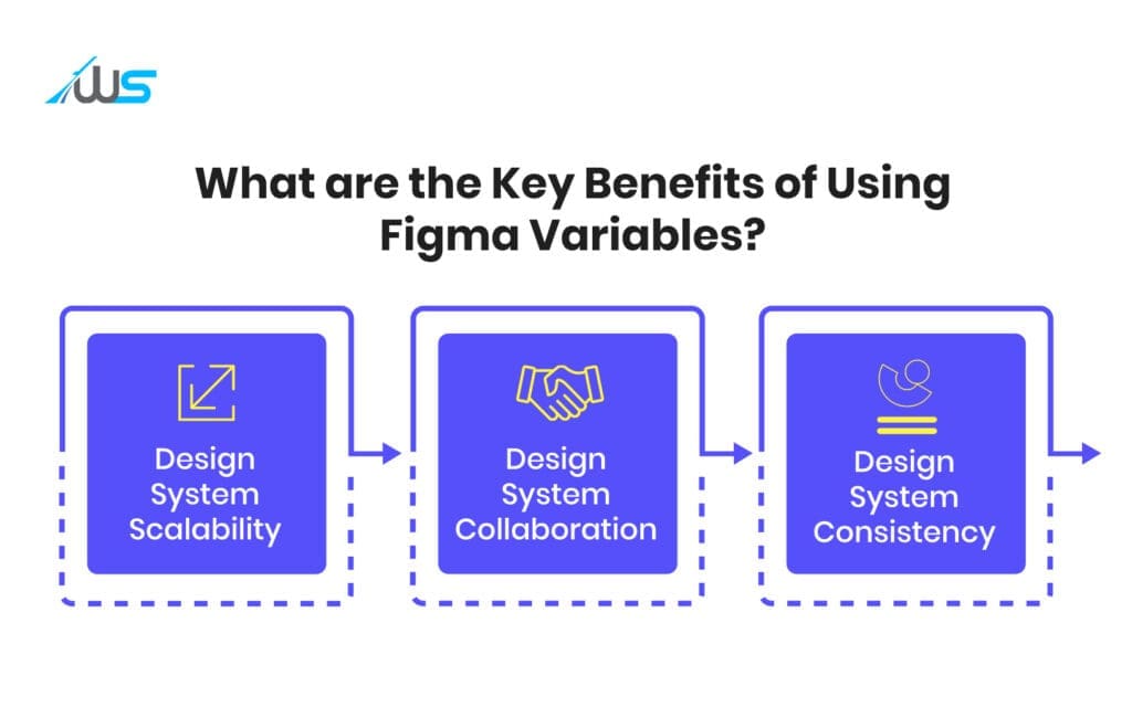
What are the Key Benefits of Using Figma Variables?
-
Design System Scalability
As your design system scales, keeping the values uniform and organized can be quite challenging. Figma variables can mitigate this issue.
Designers can keep every value in a common place with collections. This makes it easier for designers to expand and update the design system.
-
Design System Collaboration
If the variables are standardized, the collaboration between designers can be simplified significantly. If you use the same variables throughout the design system, design consistency will be ensured, and a better alignment can be observed.
Plus, with a clear and simple language, designers can easily understand and recommend changes.
-
Design System Consistency
Another major advantage is that these variables help designers ensure consistency in the design systems. By ensuring global variables for elements like typography, spacing, and colors, design teams can make sure a consistent style is applied uniformly throughout the system.
This will streamline the process, guaranteeing a cohesive and consistent appearance for all the assets.
Now that we know the key advantages, let’s explore how designers can use these variables to streamline design systems.
How can you use Figma Variables to streamline your Design System?

There are definite steps through which you can streamline your design systems with Figma variables. Let’s discuss all these steps in a brief way.
Step 1: Defining Simple Naming Conventions and Grouping Variables in a Logical Sense
You have to use hierarchical and intuitive names like spacing.small, font.heading.large, and color.primary.base to keep the Figma variables understandable and organized.
Creating the color tokens, (from Core to Semantic to Component) is the foundation of a scalable design system.
Core Values (Raw Values)
The core or raw values are the base colors (without any meaning). Examples of this:
color/core/blue-500 = #3B82F6
color/core/gray-100 = #F3F4F6
color/core/red-600 = #DC2626
Semantic Values (Purpose-Driven Values)
In this part, you have to assign meaning to them like this:
color/semantic/primary-bg = blue-500
color/semantic/text-main = gray-900
color/semantic/error = red-600
Component Values (Optional Layer)
color/component/button-bg = primary-bg
Why do Naming Conventions Matter?
-
It helps in times of rebranding. If you change blue-500 once, the entire design system can update on its own.
-
It can improve clarity.
-
This makes the design-development mapping cleaner.
Step 2: Creation of Variable Sets
Next, you have to build sets of variables for dark and light themes and different styles, allowing users to toggle effectively. This is the stage where variables become powerful.
| Variable | Light Mode | Dark Mode |
|---|---|---|
| bg | #FFFFFF | #121212 |
| text | #111111 | #EEEEEE |
However, you have to keep one thing in mind. You have to apply modes to the semantic ones, not core variables.
For instance, you have to do this:
primary-bg – (Light: white, Dark: black)
And, you should always avoid:
blue-500 – (Light: blue, Dark: lighter blue)
Why does the creation of Variable Sets Matter?
-
This allows instant switching of themes, leading to an exceptional UX.
-
It keeps the design system predictable and clean.
-
The creation can support multi-brand systems.
Step 3: Spacing, Sizing, and Layout Standardization
The Figma variables aren’t just about colors. They are more than that, and that’s why most designers underuse these variables. For instance, you can create a spacing scale.
spacing/4 = 4px
spacing/8 = 8px
spacing/16 = 16px
spacing/24 = 24px
You can apply these to:
-
Auto layout padding
-
Gaps between the elements
-
Grids and margins
You can even extend that to sizing:
radius/sm = 4px
radius/lg = 12px
border/width/thin = 1px
Why Standardization by Figma Variables Matters?
-
It promotes visual consistency and rhythm.
-
It prevents random spacing syndrome.
-
It makes layouts scalable and predictable.
Step 4: Typography Variables
Instead of setting text styles manually, you can:
Define the Variables
font/size/sm = 14px
font/size/lg = 20px
line-height/body = 1.5
letter-spacing/tight = -1%
Why Typography Variables Matter?
-
You can easily execute global updates for accessibility tweaks.
-
It also keeps the hierarchy consistent.
-
This aligns with dev typography tokens.
Step 5: Connecting Figma Variables to Components
This is the stage where Figma variables actually deliver value. For instance, for a button component, you can use:
Background → primary-bg
Text → text-on-primary
Padding → spacing/12
Doing this, you can change variables globally. In switch mode, buttons can adapt automatically.
Why Connecting Figma Variables Matters?
-
The components become reusable.
-
It can save time in large projects.
-
This step can reduce design inconsistencies.
Note: Always avoid hardcoding values inside components. You have to always use variables.
Step 6: Usage of Aliases (Variable Referencing)
Aliasing, or the usage of aliases, is nothing but variables referencing other variables. For instance:
button-bg – primary-bg
primary-bg – blue-500
Why is Aliasing Important?
-
It helps in creating a hierarchy.
-
This allows abstraction layers.
-
It makes the future changes safer and faster.
Step 7: Alignment with the Devs
Figma variables mirror:
-
CSS variables
-
Tailwind Config
-
Token-centric systems
Why Alignment with the Development Team Matters?
-
It ensures a smooth handoff to the developers.
-
It reduces misinterpretations and miscommunication.
-
Bridges the gap between design and development.
Wrapping Up
If you are in the process of developing a design system, you have to make the most out of Figma variables. It is one of the most valuable tools to streamline and improve your design system maintenance.
Furthermore, it increases efficiency and makes sure that the design delivers a superior user experience.
Do you need help creating an exceptional design system? Don’t hesitate to reach out to Webskitters.
Book a call with our experts and make your design stand out!

 UI/UX Design
  Web Development
  Mobile App Development
  Internet Of Things
  Game Development
  Artificial Intelligence
  Digital Marketing
  Data Science Consulting


